My name is Marc Belle. I work on the HMRC mobile app team as an interaction and product designer. It’s been nearly two and a half years since we released the HMRC Mobile App Design System. All public sector apps need to meet accessibility guidelines by June, so we thought it’d be a good time to provide an update on where we are.

Breaking the rules
We designed the HMRC Mobile App Design System as an extension to the GOV.UK Design System to create greater consistency in the app and enable government mobile apps to be more scalable and accessible because they are unable to use the main GOV.UK Design System.
The GOV.UK Design System is what all of government is meant to follow as a baseline, but because it is web-based it doesn’t always work for native mobile apps like ours. App design can have different requirements to websites, for example, apps use buttons not inline links because the hit area of a finger needs to be greater than that of a mouse pointer.
Apple and Google have also spent considerable time developing patterns and native components that users have become familiar with and which we can benefit from both in terms of minimal development overhead but also tried and tested accessibility.
I speak more about the creation of the Mobile App Design System in a previous post but as we discovered, in our attempts to make the app accessible, not everything can be ported from web to app design. We’ve added new components, updated others and even removed one or two.
If it’s broke, fix it
The expanding row was one of those that we have removed and was a good example of where things that work on the web don’t necessarily translate to apps very well. Ensuring the app is accessible, is high on our priority list, so each component is tested before it goes into the app and then again when it is in the environment intended for its use. In practice, the expanding row provided the ability to hide useful information that wasn’t always required but it came with its own accessibility challenges.
During testing, we found that iOS devices wouldn’t alert the user that the row had expanded. It came down to a complication where the device wouldn’t know that a change had occurred on the screen when a user had expanded or closed the row. So, for users using VoiceOver, they wouldn’t know there was new content to read. We tried a few workarounds but after a lot of trial and error, we decided that it was best to remove it. And to ensure we didn’t complicate things for ourselves by having different implementations on both platforms we removed it on Android as well.
COVID challenges
COVID-19 too brought new challenges when we needed to rapidly deploy important announcements via the app that would frequently change. Having the Mobile App Design System’s atomic approach as a basis to work from meant we could do just that. For those that don’t know, each time you make a change to the app it needs to be pushed to the Apple App and Google Play stores as an update. So, with frequently changing announcements it would have required users to download a new update each time, so we needed a way to prevent this.
We developed a new information message component that was built from other already existing components that could be constructed and deployed on demand. It then allowed us to add messages to the app without the need to republish to the Apple App and Google Play stores. Information messages could be added or removed and content updated remotely meaning users didn’t need to update their app each time there was a new announcement.
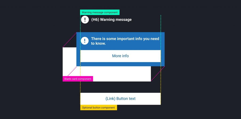
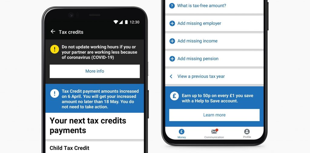
And because of the flexibility of the design system’s atomic approach, it has meant we can also use the information message to send other useful information such as letting users know if they are entitled to a Help to Save account or to sign up for paperless messages instead of post.
Better accessibility together
As we gear up to meet upcoming accessibility regulations in June the Mobile App Design System has come into its own and as version 2.2 is released, almost every area of the app now uses it and internally we’ve used it to build another two apps.
At the end of last year, we publicly open-sourced the Mobile App Design System, as well as the iOS and Android component libraries, to make it easier for HMRC, the rest of the public sector or anyone else, to make accessible apps. It’s always a work in progress but we hope you find it useful and if you use it to make an app or have any suggestions to help improve it then let us know in the comment section below.
Come work for us!
If this work sounds interesting, check out all our current digital vacancies. They’re updated regularly so worth keeping an eye on.
To make sure you don’t miss any of our blog posts, sign up for email alerts
2 comments
Comment by Mems Bangura posted on
Hi Jan,
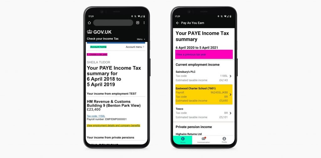
the user need varied depending on the customer. People on low or variable income depend on the app to manage their finances. They typically need to check their take home pay, and want to make sure the amount of tax they’re paying matches their pay slip.
Similarly, people whose tax code may change frequently or tax credits customers also use the app to make sure they are paying the right amount of tax. By making this data easy to access with the simple log-in on the app, we let people stay in control of their finances in the channel of their choice.
Comment by Jan Suchal posted on
This is interesting, what was the user need for creating a native app?